Coupa: Icon & Illustration System Design
Key Takeaways
When starting from scratch on a large illustration project, it’s important to generate a wide funnel of ideas for the initial phase.
Quickly generating atomic and molecular UX elements requires a systemic approach to image styling.
Aligning your design process with the development environment is the best way to scale any design work at enterprise level.
Software & Skills
Figma, Adobe Creative Suite, Pendo, Invision
Icon Design & Systems, Illustrations & Illustration Systems, Color Systems, WCAG 2.1 Accessibility Guidelines, User Centered Design, Atomic UX Design, Semantic UX Design, Scaling Platform Design
Step 1 - Define the Problem
Coupa’s BSM Platform is incredibly flexible and powerful in the hands of a powerful client administrator. The big problem was that it was confusing and difficult for administrators who didn’t have large teams of graphic designers and frontend developers.
As part of our visual overhaul, I set to producing a wide variety of icons and icon styles that fit with our existing visual metaphors for any given action in system. Ultimately, my work would have to slot in effortlessly for frontend developers who had to modify a large collection of Coupa’s products eventually and that means semantic alignment with developer’s code.
Not only did they have to fit the existing metaphor paradigm, they also had to be flexible enough to fit any brand with minimal administrator effort. Ultimately, that meant a flexible .svg set with programmatic color controls.
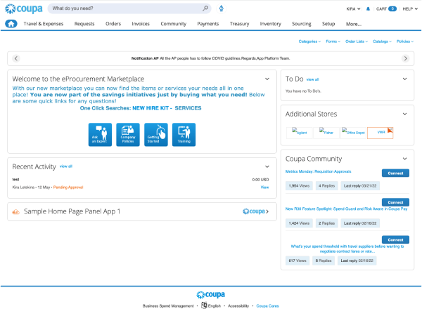
Coupa BSM Platform 2022
Coupa BSM Platform 2022
Step 2 - Generative Research
I conducted an exhaustive study of current and upcoming design trends to establish a potential workspace for our new icon & illustrations systems. There were a wide variety of design styles and approaches to choose from, among them Neumorphism, Parametric Illustration Systems, and 2D / 3D Interplay.
It’s important not to limit your generative design work by automatically aligning with what already exists.
Thankfully we had a broad canvas for this project because Coupa didn’t provide any assets to new administrators, so we started our design iteration by creating a wide variety of possible icon & illustration systems.
Step 3 - Assemble our Conceptual Library
Starting from Coupa’s existing metaphor library, I began by consolidating existing metaphors and identifying opportunities to create more extensible and scalable metaphors into the system. This was a long process of contemplating the choices our team had made system-wide and identifying opportunities to unite concepts or create distinct metaphors that would communicate an idea or action more effectively.
Taking a .png sprite sheet and tearing it apart to assemble a library of .svg assets
Step 4 - Express Different Styles across a Critical Metaphor Set
Once we had assembled a collection of core metaphors for our application’s default view, the process of construction stylistically coherent sets to compare against one another began.
This is systematic work. Identify what makes a style, and execute those design guidelines across your metaphors as uniformly as possible.
This process would also have to happen for any illustration style we wanted to evaluate. Ultimately that means several different design systems were created for icons and illustrations alike.
Icon System Mapping & Modifier System Design
Step 5 - Test, Test, Test and Produce
Following the selection of our team’s favorite icon and illustration sets, we tested each set with end users for overall likeability, collected word cloud responses for emotional context, and produced a starter set of icons and illustrations for client administrators.
Bonus! Light and Dark Themed Icon and Illustration Set System


